Pierre Area Charitable Organizations (PACO) Website Project
Tuesday, August 16, 2016
The Discovery
During our initial meeting with PACO we found out that they were looking to create a website that served a purpose, was easy to navigate and was visually appealing. We also uncovered that the organization was lacking a logo that represented their brand.
The Look
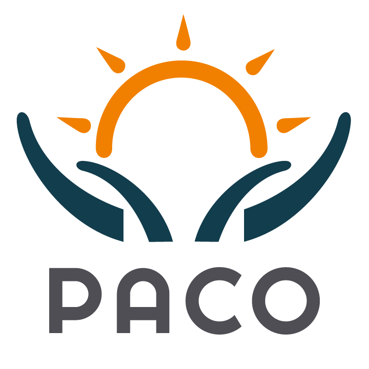
Our team created a logo that reflected their community mission. The 'hands holding up the sun' show that they are an organization where collaboration and promoting each other are greatly valued. The colors chosen are uplifting and professional as this group is made up of brilliant minds that hold a wealth of knowledge
The Technology
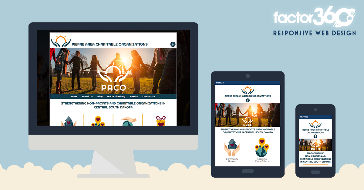
The www.pierrepaco.org website is responsive to all devices: desktop. laptop. tablet and mobile. It includes a blog, member directory, event calendar and contact form. Take a look through their site to find out more.


Save
Save
Save
Save
Categories: Brand Identity, Responsive, Web Blog, Web Design, Web Development