Plummer Insurance Gets a New Look
Tuesday, November 1, 2016
The Discovery
In 2015 Plummer Insurance came to us for a site relaunch to a responsive web layout and after only one year they were back for an update due to new available technologies. We were able to take some of the original elements of their previous design and work them into a new look. Plummer Insurance was also implementing a new tool and customer online portal to increase ease of access of quick information.
The Look
Elements of design the were carried over from the previous and new aspects were added. We maintained the former blue, green and gray color scheme and used it to create space between the main topics: what they offer, who they are and helpful resources for those looking for more information. The Plummer "P" from the the logo inspired other elements that help separate the sections also the bullets resemble the same shape.
The Technology
The plummerinsurance.com website is still responsive to all devices: desktop, laptop, tablet and mobile devices. It includes a blog module and forms built with 360WebCMS. The customer portal and custom quote technologies were able to be integrated into the website. Take a look through their site to find out more.
Project Highlight
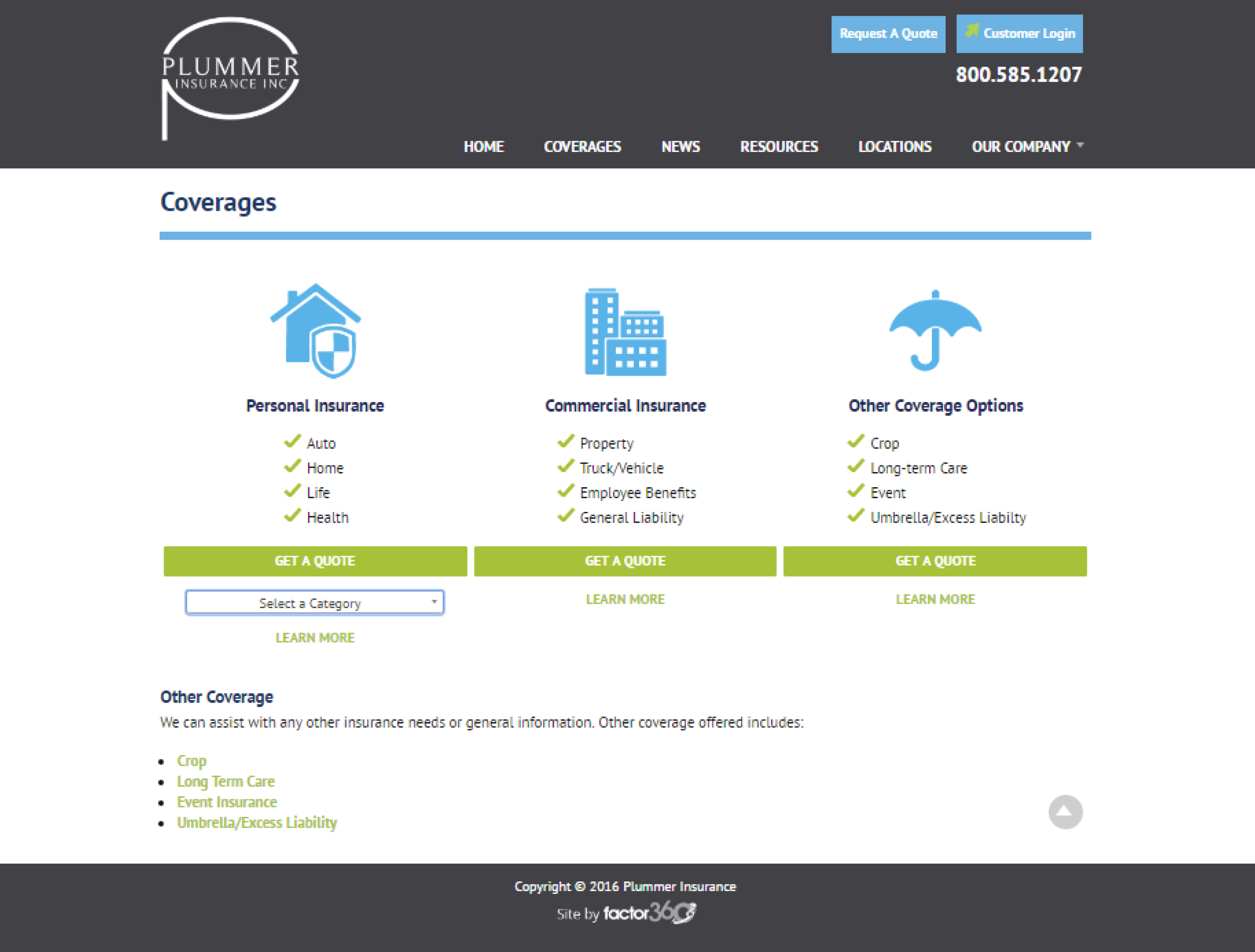
The goal is focus on the user: decreasing the amount of time a user needs to click to find what they are looking for. The new Plummer Insurance Coverages page offers all the information on one page. This is very helpful for a prospective customer searching for insurance information.
Like what you see? Leave a comment below or contact us here!

Categories: Responsive, SEO/SEM, Web Blog, Web Design, Web Development